Own stylesheet (Custom CSS)
Add custom CSS to your Shoporama online store and admin backend. Customize colors, fonts, layout and hide elements without changing theme files.
Med funktionen Eget Stylesheet kan du tilføje brugerdefineret CSS til både din webshop og din admin-backend. Det er ideelt til designjusteringer som ændring af farver, skrifttyper, marginer eller skjulning af elementer — uden at ændre i temafiler.
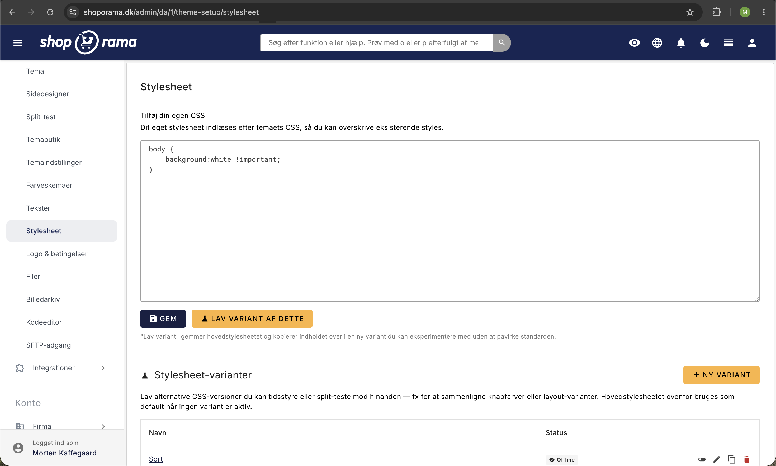
Sådan tilføjer du CSS
- Gå til Design i menuen
- Klik på Stylesheet
- Indtast din CSS-kode i tekstfeltet
- Klik Gem
Din CSS indlæses efter de eksisterende stylesheets, så dine regler overskriver standardstile. Det gælder for både webshoppens forside og admin-panelet.
Webshop-tilpasninger
Her er eksempler på typiske tilpasninger af webshoppens forside:
Ændr baggrundsfarve på headeren:
header {
    background-color: #1a1a2e;
}
Ændr skrifttype:
body {
    font-family: 'Georgia', serif;
}
Skjul et element på forsiden:
.element-class {
    display: none;
}
Admin-tilpasninger
Du kan også bruge Eget Stylesheet til at tilpasse udseendet af admin-panelet. Nedenfor finder du en komplet oversigt over de CSS-klasser og ID'er du kan bruge.
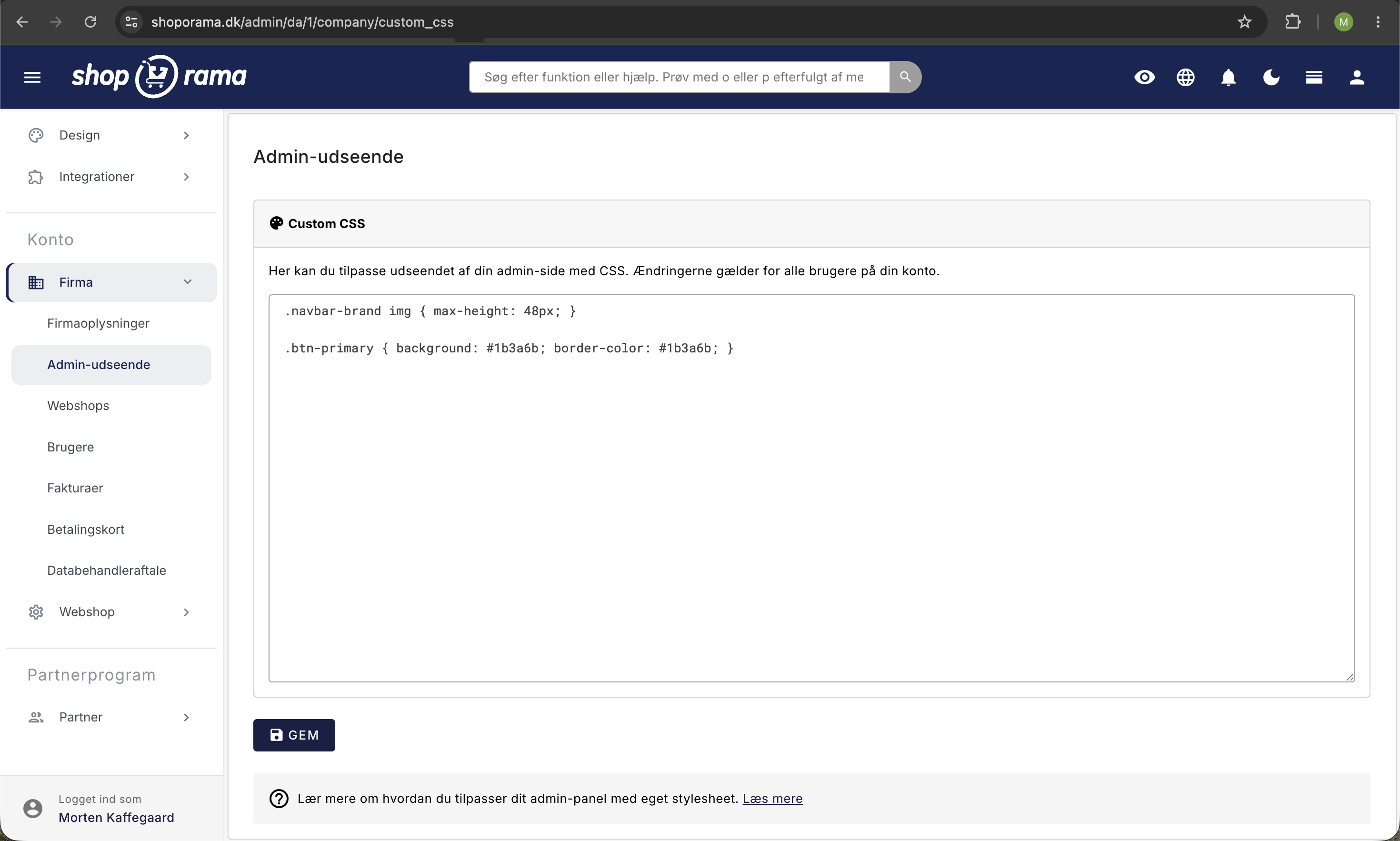
Bemærk: I admin skal du ofte tilføje !important for at overskrive de eksisterende Bootstrap-stile.
Ordrelisten — CSS-klasser på ordrerækker
Hver ordrerække i ordrelisten har en række dynamiske CSS-klasser, som du kan bruge til at style ordrer baseret på deres status, betaling og leveringsmetode.
Betalingsstatus
| Klasse | Hvornår |
|---|---|
| .paid | Ordren er betalt |
| .unpaid | Ordren er ikke betalt |
Eksempel — Rød baggrund på ubetalte ordrer:
.unpaid {
    background-color: #ffe0e0 !important;
}
Ordrestatus
Ordrerækkens status tilføjes direkte som klasse:
| Klasse | Status |
|---|---|
| .new | Ny ordre |
| .process | Igang |
| .pending | Afventer |
| .ready | Klar |
| .ready_for_pickup | Klar til afhentning |
| .picked_up | Afhentet |
| .sent | Sendt |
| .credit | Krediteret |
| .cancelled | Annulleret |
Eksempel — Grøn baggrund på sendte og betalte ordrer:
.paid.sent {
    background-color: #ddffeb !important;
}
Eksempel — Nedtonet visning af annullerede ordrer:
.cancelled {
    background-color: #eee !important;
    opacity: 0.7;
}
Leveringsmetode
Leveringsmetodens navn konverteres automatisk til en CSS-klasse. Alle bogstaver bliver små, og specialtegn erstattes med underscore. Fx bliver "Hjemmeadresse med GLS" til klassen .hjemmeadresse_med_gls.
Eksempel — Farvemarkér ordrer efter leveringsmetode:
/* GLS-ordrer med orange baggrund */
.hjemmeadresse_med_gls {
    background-color: #fff3e0 !important;
}

/* PostNord-ordrer med blå baggrund */
.postdanmark_til_privatadresse {
    background-color: #e3f2fd !important;
}
Tip: For at finde den præcise klasse for din leveringsmetode: Højreklik på en ordrerække i ordrelisten, vælg "Undersøg element", og se klasserne på <tr>-elementet.
Betalingsgateway
Hver ordrerække får en klasse baseret på betalingsgatewayens ID i formatet .payment-{ID}. Du finder ID'et ved at gå til Integrationer → Betalingsgateways og se URL'en når du klikker på redigér.
Eksempel — Grøn baggrund for ordrer betalt med en bestemt gateway:
.payment-{id} {
    background-color: #c8e6c9 !important;
}
Andre ordrerække-klasser
| Klasse | Hvornår |
|---|---|
| .ean | Ordren har et EAN-nummer |
| .credit_note | Ordren er en kreditnota |
| .has_pickup_address | Ordren har afhentningsadresse (pakkeshop) |
| .no_pickup_address | Ingen afhentningsadresse |
| .shopgatewayfail | Shop-gateway overførsel fejlede |
Eksempel — Fremhæv EAN-ordrer:
.ean {
    background-color: #c2caff !important;
}
Ordredetaljer — klasser i den udvidede visning
Når du klikker på en ordre i listen, vises ordredetaljer med disse klasser:
Ordreindhold
| Klasse | Beskrivelse |
|---|---|
| .order-details-content | Hele den udvidede ordredetalje-sektion |
| .order-internal-comments | Interne kommentarer-feltet |
| .order-content-name | Produktnavn |
| .order-content-sku | Varenummer (SKU) |
| .order-content-comment | Ordrekommentar fra kunden |
Lagerstatus
| Klasse | Beskrivelse |
|---|---|
| .itemsinstock | Varen er på lager |
| .itemsnotinstock | Varen er ikke på lager |
| .shoporama-stock-in-stock | Lager > 0 |
| .shoporama-stock-out-of-stock | Lager = 0 |
| .order-content-amount-multiple | Antal > 1 på ordrelinjen |
Eksempel — Rød tekst på varer der ikke er på lager:
.itemsnotinstock {
    color: #ff0000 !important;
    font-weight: bold;
}
Knapper i ordrelisten
Knapperne i ordrelisten har faste ID'er, som du kan style:
Primære knapper
| ID | Knap |
|---|---|
| #btn-print | Print følgesedler |
| #btn-mail | Send e-mail |
| #btn-clone | Kopier ordre |
| #btn-new_invoice | Gensend ordrebekræftelse |
| #btn-send_sent | Gensend ordre-sendt mail |
| #btn-current-view | CSV-eksport |
| #btn-shop-order-queue | Vis ordrekø |
Fragtknapper
| ID | Knap |
|---|---|
| #btn-gls-api | Send til GLS |
| #btn-gls-pdf | Download GLS pakkelabels |
| #btn-gls-api-return | Opret GLS returseddel |
| #btn-postnord-api | Send til PostNord |
| #btn-postnord-pdf | Download PostNord pakkelabels |
| #btn-dao-pickup | DAO (afhentning) |
| #btn-dao-pdf | Download DAO pakkelabels |
| #btn-burd | Send til Burd |
| #btn-burd-pdf | Download Burd pakkelabels |
| #btn-shop-gateway | Shop Gateway eksport |
| #btn-swipbox | Swipbox eksport |
| #btn-gls | GLS Uni-Connect |
Eksempel — Fremhæv print-knappen:
#btn-print {
    background-color: green !important;
    color: white !important;
}
Eksempel — Skjul fragtknapper du ikke bruger:
#btn-swipbox,
#btn-gls {
    display: none !important;
}
Webshop-specifik styling
Hvis du administrerer flere webshops fra samme firma, kan du style admin forskelligt per webshop. Body-elementet har klassen webshop{ID} hvor ID er webshoppens ID-nummer.
Eksempel — Forskellig header-farve per webshop:
/* Din første webshop — rød header */
body.webshop{id} nav.top-app-bar {
    background-color: #ad3c3c !important;
}

/* Din anden webshop — blå header */
body.webshop{id} nav.top-app-bar {
    background-color: #2a50a6 !important;
}
Tip: Du finder din webshops ID i URL'en i admin, eller ved at undersøge body-elementet med browserens udviklerværktøjer.
Layout og navigation
| Element | Beskrivelse |
|---|---|
| nav.top-app-bar | Den øverste navigationsbar |
| .drawer-light | Venstremenuen (sidebar) |
| .drawer-menu | Menu-listen i sidebaren |
| .drawer-menu .nav-link | Menu-links i sidebaren |
| .drawer-footer | Bunden af sidebaren |
| #layoutDrawer_content | Hovedindholdsområdet |
Eksempel — Ændr farven på venstremenuen:
.drawer-light .drawer-menu .nav-link {
    color: #333 !important;
}

.drawer-light .drawer-menu .nav-link:hover {
    background-color: #f0f0f0 !important;
}
Andre nyttige elementer
| Element | Beskrivelse |
|---|---|
| #demo_progress | Demo-fremskridtsboks (skjul med display:none) |
| #help | Hjælpeboks |
| td.more_unsent | Ordrenummer-cellen når der er flere usendte forsendelser |
| td.bought_before | Ordrenummer-cellen for gentagelseskøb |
| .container-fluid | Sidebredde (kan sættes til width:90% for bredere visning) |
Populære use cases
Farvekodning af ordrelisten
Et populært setup er at farvekode ordrelisten, så du hurtigt kan skelne mellem betalte/ubetalte ordrer og forskellige statusser:
/* Ubetalte ordrer i lys rød */
.unpaid {
    background-color: #fff0f0 !important;
}

/* Betalte og sendte ordrer i lys grøn */
.paid.sent {
    background-color: #f0fff0 !important;
}

/* Annullerede ordrer nedtonet */
.cancelled {
    background-color: #f5f5f5 !important;
    opacity: 0.6;
}

/* EAN-ordrer i lys blå */
.ean {
    background-color: #f0f4ff !important;
}
Fremhæv vigtige handlingsknapper
/* Grøn print-knap */
#btn-print {
    background-color: #28a745 !important;
    color: white !important;
}

/* Grøn GLS-knap */
#btn-gls-api {
    background-color: #ff9800 !important;
    color: white !important;
}
Gør ordrelisten bredere
.container-fluid {
    max-width: 100% !important;
}
Tydelig markering af varer ikke på lager
.itemsnotinstock {
    color: #ff0000 !important;
    font-weight: bold;
    font-size: 1.1em;
}
Sådan finder du den rigtige CSS-selector
For at finde den præcise klasse eller ID for et element:
- Højreklik på elementet i din browser
- Vælg Undersøg element (Inspect)
- Find elementets klasse (fx class="unpaid sent") eller ID
- Brug klassen eller ID'et som CSS-selector i dit stylesheet
Tip: Brug browserens udviklerværktøjer (F12) til at teste CSS-ændringer i realtid, før du gemmer dem i Eget Stylesheet.
Større designændringer
Eget Stylesheet er velegnet til mindre tilpasninger. Til større designændringer anbefales det at redigere selve temafilerne via SFTP. Se artiklen Log på med SFTP for at komme i gang.
CSS cheat sheet
Her er en hurtig oversigt over de mest brugte CSS-egenskaber, så du kan komme i gang uden at skulle slå det op.
Farver
Farver kan angives som navne, hex-koder eller RGB:
/* Hex-kode (mest brugt) */
color: #ff0000;              /* Rød tekst */
background-color: #f0f0f0;  /* Lys grå baggrund */

/* Farvenavne */
color: red;
background-color: white;

/* RGB med gennemsigtighed */
background-color: rgba(0, 0, 0, 0.1);  /* Sort, 10% synlig */
Nyttige farvekoder:
| Kode | Farve | Brug |
|---|---|---|
| #fff0f0 | Lys rød | Ubetalte ordrer |
| #f0fff0 | Lys grøn | Betalte/sendte ordrer |
| #f0f4ff | Lys blå | EAN-ordrer |
| #fff3e0 | Lys orange | Fremhævning |
| #f5f5f5 | Lys grå | Nedtonet/annulleret |
Skrifttype (font-family)
/* Skift skrifttype */
font-family: 'Georgia', serif;
font-family: 'Arial', sans-serif;
font-family: 'Courier New', monospace;

/* Google Fonts (tilføj import øverst i dit stylesheet) */
@import url('https://fonts.googleapis.com/css2?family=Open+Sans&display=swap');
font-family: 'Open Sans', sans-serif;
Tekst
font-size: 14px;            /* Tekststørrelse */
font-weight: bold;          /* Fed tekst (eller 400, 600, 700) */
font-style: italic;         /* Kursiv */
text-align: center;         /* Centreret (left, right, center) */
text-decoration: underline; /* Understregning */
text-transform: uppercase;  /* Store bogstaver (lowercase, capitalize) */
line-height: 1.5;           /* Linjeafstand */
letter-spacing: 1px;        /* Bogstavmellemrum */
Baggrund
background-color: #f0f0f0;
background-image: url('https://example.com/bg.png');
background-size: cover;     /* Fyld hele området */
background-repeat: no-repeat;
Rammer (border)
border: 1px solid #ccc;           /* Ramme rundt om hele elementet */
border-bottom: 2px solid #333;    /* Kun bund-ramme */
border-left: 4px solid #28a745;   /* Grøn venstre-ramme */
border-radius: 8px;               /* Afrundede hjørner */
border: none;                     /* Fjern ramme */
Afstande (margin og padding)
/* Padding = indvendig afstand */
padding: 10px;              /* Alle sider */
padding: 10px 20px;         /* Top/bund, venstre/højre */
padding-left: 15px;         /* Kun venstre */

/* Margin = udvendig afstand */
margin: 10px;               /* Alle sider */
margin-bottom: 20px;        /* Kun bund */
margin: 0 auto;             /* Centrér et element */
Vis/skjul
display: none;       /* Skjul helt (fylder ikke) */
visibility: hidden;  /* Usynlig (fylder stadig) */
opacity: 0.5;        /* Halvt gennemsigtig (0 = usynlig, 1 = fuld) */
Størrelse
width: 100%;         /* Fuld bredde */
max-width: 800px;    /* Maksimal bredde */
height: 50px;        /* Fast højde */
min-height: 200px;   /* Minimum højde */
Skygger
box-shadow: 0 2px 4px rgba(0,0,0,0.1);    /* Blød skygge */
box-shadow: 0 4px 12px rgba(0,0,0,0.15);  /* Kraftigere skygge */
box-shadow: none;                          /* Fjern skygge */
Har du brug for hjælp? Kontakt os på support@shoporama.dk.
Related articles
Notification under SFTP information
Learn how you as a theme developer can display a message on the admin page with SFTP login details.
Optimizing images for mobile
Guide to using responsive images with srcset in your Shoporama theme to provide optimized images for mobile users.
Extended fields
Learn how to use Shoporama extended fields to add extra content to your products, categories and pages - defined by your theme.