The newsletter sign-up form shouldn't always pop up
Your sign-up form no longer has to be a pop-up. Now you can copy it right where you want it to appear and run multiple different forms, each for its own list. Here are the five situations where this makes a difference.
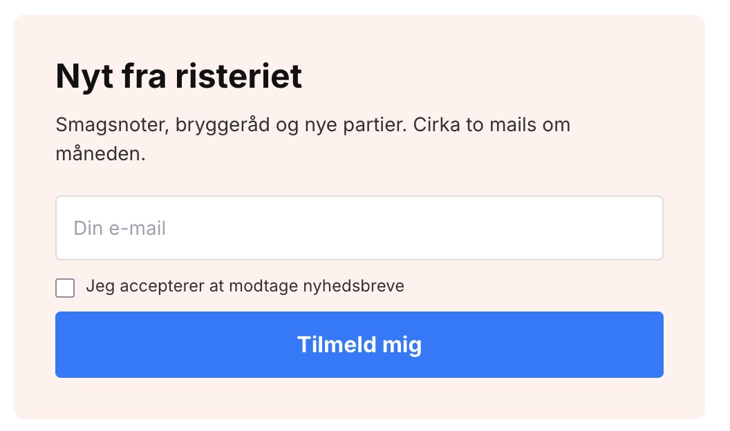
A pop-up is a useful tool, but it’s not a one-size-fits-all solution. It’s disruptive, it can be closed, and only one can be displayed at a time. At the same time, there’s a type of visitor that pop-ups never reach: those who are actively looking for the sign-up form because they’ve already made up their minds.
That’s why you can now embed your sign-up form directly onto a page. You design it exactly as before under Newsletter → Sign-up Form, but instead of having it pop up, you copy a single line of code and paste it where you want the form to appear.
Here’s how to do it
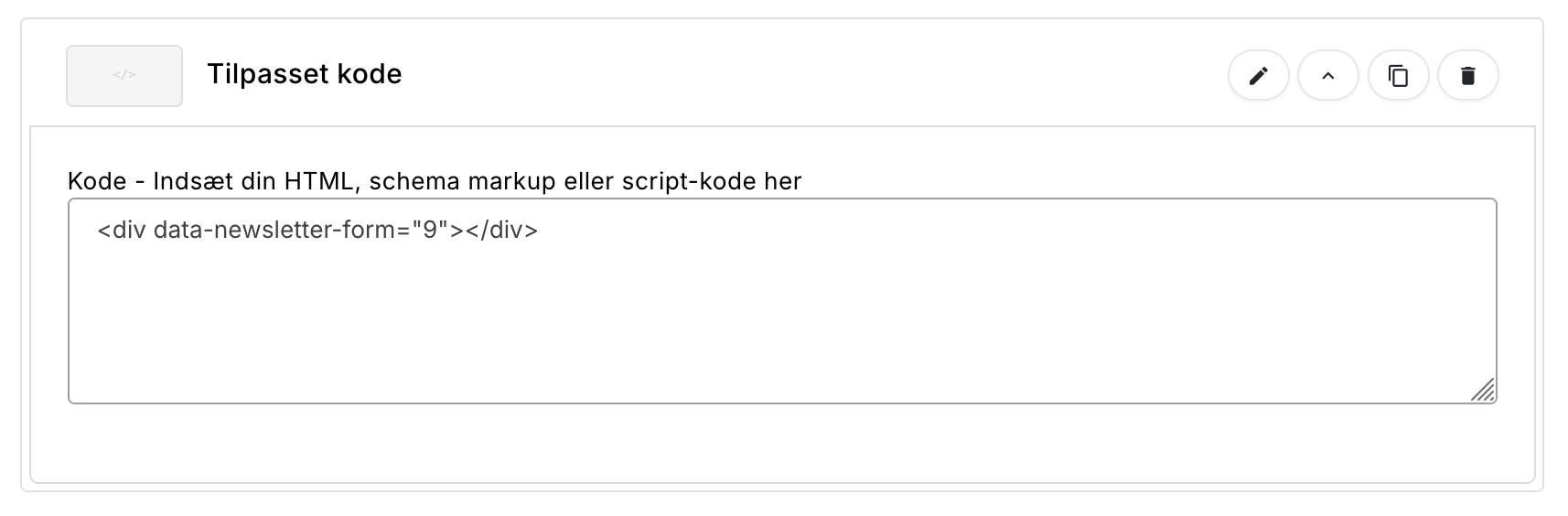
Open a sign-up form and go to the new Embed tab. There you’ll find a short code that you can copy with a single click. It looks like this, where the number is the form’s unique ID:
<div data-newsletter-form="9"></div>The code can be inserted in three places. If you’re using the Page Builder, add a Custom Code block and paste the code into it. Then you can drag the form up and down among the other sections, just like anything else on the page.
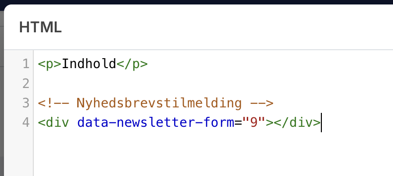
If you want to place the form in the middle of the text on an information page, open “Source Code” in the text editor and paste the code where you want it to appear. It will then be part of the text, and you can write both before and after it.
And if you edit your theme files yourself, you might as well place the code directly in the theme. The result is the same: the form is rendered when the page is displayed, with the design, fields, and list you’ve selected in the admin panel.
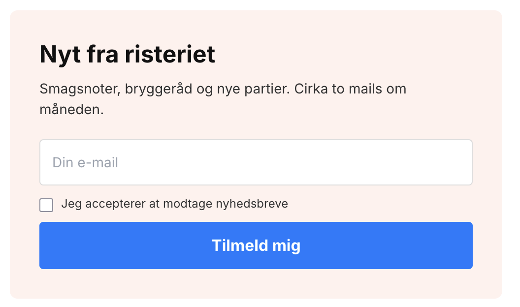
Because the form is built by Shoporama and comes with its own design, it works in all themes, including custom-built ones. You don’t need to change anything in the theme or install anything.
Five situations where it makes a difference
1. A real sign-up page
Most online stores have a small field at the bottom of the page—and not much else. With an embedded form, you can create a dedicated page where you have space to explain what people will get, how often you’ll post, and what you’ll use their email address for. Place it in the menu or in the footer, and link to it from your social media accounts. Pages like this convert well because the visitors who land on them are already interested.
2. Multiple lists, each in its own place
Each form can sign up subscribers to its own list. This opens up possibilities that a single pop-up could never offer: a waitlist for an upcoming product, embedded right on the product page itself. A list exclusively for business customers on your B2B site. A club or loyalty program with its own sign-up form. Subscribers land on their own respective lists and can be segmented accordingly, rather than ending up in one big pile.
3. Campaign pages and blog posts
If you’re building a landing page for a campaign, the sign-up form belongs on the page itself, not in a pop-up overlaying it. The same applies at the bottom of a blog post, where the reader has just spent three minutes reading your text and is most likely to want more. You can even use a form with a different headline and design than the one you use throughout the rest of the store.
4. A tablet in the physical store
If you have both an online store and a physical store, a tablet at the checkout is an obvious way to collect sign-ups. The key difference here is that the embedded form never disappears. A pop-up closes automatically after a certain number of days once it’s been closed or filled out, so only the first customer would be able to use it. The embedded form can be used again immediately by the next person in line.
5. Customers who have declined the pop-up
When a visitor closes your pop-up, it disappears for the number of days you’ve selected. But people change their minds, often after shopping with you a few times. If there’s a form on a page they can find on their own, it costs them nothing more than a click to sign up after all.
The pop-up is still there
The automatic display hasn’t changed. There can still only be one form that pops up on its own, and that’s by design: two pop-ups on the same page create a poor experience for everyone. However, all your forms can be embedded manually—including those marked as inactive and even the one that’s currently running as a pop-up.
If you edit the design afterward, the change will take effect everywhere the code appears. So you don’t need to go out and copy it in again. And sign-ups from embedded forms are counted separately in the “Embedded” column of the overview, so they aren’t mixed in with the pop-up conversions.
If you’re using Montana or Delaware, you’ll also have a pre-built block
If your store runs one of our themes— Montana, Montana B2B, Delaware, or Delaware DK—there’s already a Newsletter section in the Page Builder. Simply drag it onto the page without touching a single line of code, and you can choose between three layouts: simple, centered with a background image, or split with an image on the side. The headline, description, button text, name field, consent text, image, and light or dark text are entered directly into the module, and in the Montana themes, you can also choose a background color.
Each option serves a different purpose, so choose based on what you’re looking for:
- The theme’s Newsletter section fits into the theme’s own design and is the quickest to set up. However, it’s only available in the four themes, and subscriptions always go to your default list.
- The embedded sign-up form uses the design you’ve set up yourself in the admin panel, works in all themes—including custom-built ones—and can subscribe users to the exact list you choose. However, it requires copying a single line of code.
If you just need a nice sign-up form on the front page and you’re using one of the four themes, go with the theme’s section. If you need multiple forms for different lists, or if you’re using a custom-built theme, go with the embedded form.
Get started
You’ll find everything under Newsletter → Sign-up Form. If you haven’t used the newsletter module before, you’ll first need to enable “Use internal newsletter list ” under Newsletter → Setup. Without this, sign-ups cannot be processed.
If you have any questions, feel free to email us at support@shoporama.dk.
Related articles
The newsletter module
Complete guide to Shoporama's built-in newsletter module. Learn how to create campaigns, segment recipients, use A/B testing, set up automatic...
Page designer
Lær hvordan du bruger Sidedesigner i Shoporama til at opbygge sidelayouts med blokke som hero-sektioner, produktlister, bannere og meget mere, helt...
More from the blog
The picking list has been redesigned: scan the items, print the picking slip
The picking list has been completely redesigned. You can now scan items with a standard barcode scanner, print both a picking slip per order and a...
08. september 2026
How much should shipping cost? Here's how to find the answer in your own store
A new shipping rate can improve conversion by 21% and still generate less revenue. That’s why Shoporama’s A/B tests of shipping rates are based on...
05. september 2026
Product filtering is here, and you build the filter yourself
Product filtering is currently available in the Montana and MontanaB2B themes and can be added to your own theme. You can set up the filter...
02. september 2026