New visitor statistics - understand your eCommerce traffic
Shoporama has a dedicated visitor statistics page that gives you a full overview of who visits your store, where they come from and when they shop. All without leaving your admin panel.
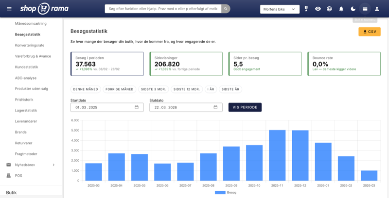
Most online store owners know they have visitors—but not much more than that. How many were there last week? Do they come from Google or Facebook? Is Tuesday or Friday the best day? And do people even look at more than one page?
Until now, finding the answers required either Google Analytics or a good deal of guesswork. Now, Shoporama has a dedicated visitor statistics page that brings it all together in one place—right in your admin panel, without any third-party tools.
Four key metrics that tell the story
At the top of the page, you’ll find four color-coded charts showing the most important figures for the selected time period:
- Visits during the period — number of unique sessions, with a percentage change compared to the corresponding previous period.
- Page views — the total number of pages your visitors have viewed. More page views per visit indicate greater engagement.
- Pages per visit — the average that shows whether people are browsing or leaving right away. The chart changes color: green for 3+, yellow for 2–3, and blue for under 2.
- Bounce rate — the percentage of visitors who leave the store after viewing only one page. Below 40% is good, 40–60% is normal for online stores, and above 60% is a sign that something needs improvement. Read more about bounce rate in our glossary.
All four cards automatically compare data to the corresponding period in the previous year, so you can always see if things are moving in the right direction.
Traffic Sources — Find out where your visitors are coming from
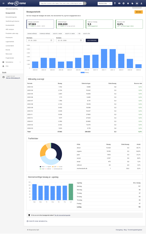
A donut chart and a table show the breakdown of your visitors by source: direct visits, Google Search (organic), Google Ads, Facebook, Facebook Ads, newsletters, and other referring sites.
This is where you can see if your marketing budget is paying off. Did you just run a Facebook campaign? Check to see if Facebook traffic has increased. Are you paying for SEO? Track Google search traffic month by month. The numbers give you concrete data instead of gut feelings—and they’re ready in seconds, without having to log in to a separate analytics tool.
Weekday distribution—when do your customers shop?
A bar chart and a table show average visits broken down by day of the week. The busiest day is highlighted in green, so you can see at a glance when your customers are most active.
Use this to time your newsletters and promotions. If Tuesday and Wednesday consistently have the most visits, send your newsletter on Tuesday morning—that way, you’ll reach people when they’re already in shopping mode. It’s a small change that can make a noticeable difference.
Daily and Monthly Overview
A detailed table shows visits, page views, pages per visit, and bounce rate for each day or month within the selected period. If you select up to 31 days, you’ll see daily figures; periods longer than 31 days are automatically aggregated into months.
The bar chart at the top provides a visual overview of trends, while the table shows the exact figures. You can export everything to CSV if you want to work with the data further in Excel or share it with a collaborator.
How can you use this in practice?
Statistics are only valuable if they lead to action. Here are some concrete examples:
- Evaluate your ads: You’ve spent money on a Facebook campaign. Under “Traffic Sources,” you can see if Facebook traffic actually increased—and whether visitors stayed on the site or bounced right away.
- Compare periods: Compare this March to last March. Do you have more visitors this year? If traffic is the same but sales are lower, the problem isn’t visibility—it’s something on the page itself.
- Track your SEO efforts: If you’re investing in search engine optimization, you can track organic traffic from Google month by month. If it doesn’t increase over 3–6 months, it’s worth having a conversation with your SEO provider—with concrete numbers in hand.
- Check your product pages: A high bounce rate can mean that people are landing on your store and leaving right away. If you’ve changed your homepage or a landing page and see the bounce rate rise, you know the change didn’t work.
- Plan campaigns: The day-of-the-week analysis shows when your customers are most active. Use this to plan newsletters, social media posts, and campaign launches.
Do you still need to use Google Analytics?
Shoporama’s visitor statistics don’t completely replace Google Analytics—but for most store owners, they cover daily needs. You get the metrics you actually use, right in your admin panel, without a separate login, without complicated reports, and without having to worry about cookie consent for yet another third-party script.
If you need advanced features like user flow, heat maps, or detailed e-commerce tracking, Google Analytics and server-side tracking are still relevant. But for your daily overview, the new visitor statistics are all you need.
How to Find the Visit Statistics
You’ll find the page under Statistics → Visit Statistics in the left-hand menu of the admin panel. The statistics require that you’ve enabled internal visit statistics under Settings —if it’s not turned on, you’ll see a warning at the top of the page with a direct link to enable it.
Data is displayed starting from the day you enabled the statistics, so the sooner you turn them on, the more historical data you’ll accumulate. The default period is the last 12 months, but you can freely choose between short intervals or specify the exact period you want to view.
The visitor statistics are naturally linked to the other statistics pages. Under “Conversion Rate,” you can see how many of your visitors actually make a purchase, and under the “Statistics Overview, ” you’ll find all of Shoporama’s analytics tools in one place. For a deeper understanding of your products’ value, see also the ABC analysis.
Related articles
Statistics and analytics in Shoporama
Get an overview of Shoporama's built-in statistics tools: dashboard, revenue, profit margin, ABC analysis and much more. Learn how to use data to...
Conversion rate - understand and improve your stats
Understand what your conversion rate means and how to use the statistics page in Shoporama to track your progress over time.
Customer statistics - understand your customers' behavior
The Customer Statistics page in Shoporama gives you an overview of return rates, customer segments and your most valuable customers.
See your revenue
Guide to viewing your revenue in Shoporama - both on the front page, via the detailed revenue statistics with graphs, and via order export.
ABC analysis: Find out which products make you money
Learn how to use ABC analysis to prioritize your assortment, optimize your inventory and focus on the products that actually drive your business.
More from the blog
The picking list has been redesigned: scan the items, print the picking slip
The picking list has been completely redesigned. You can now scan items with a standard barcode scanner, print both a picking slip per order and a...
08. september 2026
How much should shipping cost? Here's how to find the answer in your own store
A new shipping rate can improve conversion by 21% and still generate less revenue. That’s why Shoporama’s A/B tests of shipping rates are based on...
05. september 2026
Product filtering is here, and you build the filter yourself
Product filtering is currently available in the Montana and MontanaB2B themes and can be added to your own theme. You can set up the filter...
02. september 2026