Statistics and analytics in Shoporama
Get an overview of Shoporama's built-in statistics tools: dashboard, revenue, profit margin, ABC analysis and much more. Learn how to use data to make better decisions.
Mange webshop-ejere har en fornemmelse af, at det går godt — eller skidt — men det er svært at handle på en fornemmelse. De bedste beslutninger træffes på baggrund af data: Hvilke produkter tjener dig faktisk penge? Hvilke leverandører performer bedst? Hvornår sælger du mest, og hvornår er der stille?
Shoporama har en række indbyggede statistikværktøjer, der giver dig svar på netop de spørgsmål — uden at du behøver at eksportere data til Excel eller betale for dyre tredjeparts-analyseværktøjer. Alt fra daglige nøgletal til dybdegående lønsomhedsanalyse er samlet ét sted, tilgængeligt direkte i dit admin-panel.
Du finder alle statistikfunktionerne under Statistik i venstremenuen i administrationen. Denne artikel giver dig et overblik over hver enkelt funktion, hvad den viser, og hvornår du med fordel kan bruge den.
Dit daglige overblik: Hvad skete der i dag?
Dashboardet er det første du ser, når du åbner statistiksiden, og det er designet til at give dig et hurtigt sundhedstjek af din butik. Det tager to sekunder at åbne og giver dig øjeblikkeligt svar på, om der er gang i handlen.
Øverst ser du dagens omsætning sammenlignet med gårsdagen, samt antal ordrer og gennemsnitlig ordreværdi. Derunder finder du bredere tal: omsætning for denne måned, sidste måned, de seneste tre måneder og de seneste tolv måneder. Du kan skifte mellem visning med og uden moms, så du får det tal der passer til din kontekst.
Dashboardet viser også, hvor stor en andel af dine kunder der er tilbagevendende — et nøgletal der siger meget om, hvor godt din butik fastholder kunder over tid. En uge-til-uge sammenligning gør det nemt at spotte, om tingene bevæger sig i den rigtige retning.
Gør det til en vane at tjekke dashboardet dagligt. Det er din daglige pulsmåling — og det kræver ingen opsætning overhovedet.
Hvem leverer mest til bundlinjen? Salg fordelt på leverandører
Under Statistik → Leverandører kan du se, hvordan dine salg fordeler sig på leverandører. For hver leverandør vises antal ordrer, antal solgte produkter og omsætning ekskl. moms. Du kan filtrere på datointerval, og standarden dækker hele året.
Tallene giver dig et solidt grundlag for at prioritere dine leverandørrelationer. Hvis én leverandør står for 60% af din omsætning, bør det afspejles i den tid og opmærksomhed du giver forholdet. Omvendt kan det give mening at konsolidere, hvis du har mange leverandører der kun bidrager marginalt.
Kombinerer du leverandørstatistikken med ABC-analysen, får du et endnu skarpere billede: filtrér ABC-analysen på den enkelte leverandør for at se, hvilke af deres produkter der faktisk performer — og hvilke der fylder i kataloget uden at bidrage til salget.
Hvilke brands sælger bedst? Salg fordelt på brands
Brand-statistikken under Statistik → Brands fungerer på samme måde som leverandørstatistikken, men opdeler tallene efter brand i stedet. Det er særligt nyttigt, hvis du fører flere brands fra den samme leverandør og gerne vil vide, hvilke brands der trækker mest.
Tallene er også gode at have med til leverandørmøder. Du kan dokumentere præcist, hvor stor en andel et bestemt brand har af dit salg — og bruge det som udgangspunkt for forhandlinger om priser, markedsføringsbidrag eller sortimentsudvidelser.
Hold styr på returneringer — og hvad de koster dig
Returneringer er en uundgåelig del af e-handel, men de behøver ikke være en sort boks. Under Statistik → Returvarer ser du en oversigt over returnerede produkter med produktnavn, variant og antal returneringer i den valgte periode.
Det vigtigste du får ud af denne statistik er at spotte problemprodukter. Hvis en bestemt variant returneres markant oftere end andre, kan det være et tegn på fejl i størrelsesvejledningen, kvalitetsproblemer eller misvisende produktbeskrivelser. I ét tilfælde har en webshopejer opdaget en produktionsfejl i en bestemt størrelse, fordi returstatistikken viste, at den blev returneret tre gange oftere end de øvrige størrelser.
Brug statistikken løbende til at identificere returmønstre og handle på dem — det er billigere at forbedre en produktbeskrivelse end at håndtere endnu en returnering. Se også guiden til returcenteret for at lære mere om, hvordan du håndterer returneringer i Shoporama.
Sådan fordeler dine kunder sig på forsendelsesmetoder
Under Statistik → Fragtmetoder ser du, hvor mange ordrer der er afsendt med hver fragtmetode i den valgte periode. Det giver dig et klart billede af, hvad dine kunder foretrækker.
Den praktiske værdi ligger i forhandlingsgrundlaget. Kan du se, at 70% af dine ordrer går med GLS og kun 5% med PostNord, har du et stærkt argument for at forhandle en bedre GLS-aftale — og måske overveje, om PostNord overhovedet er værd at tilbyde. Færre fragtmuligheder i checkout kan også forenkle processen for dine kunder og reducere tvivl.
Hvor i landet handler dine kunder? Leveringskortet
Under Statistik → Leveringskort kan du se på et kort, hvor dine kunder får leveret deres pakker. Leveringerne samles på postnummer- og by-niveau, så du får et geografisk overblik uden at kigge på enkelte adresser.
Du kan vælge mellem et varmekort, der viser dine hotspots med farver (rødt betyder flest leveringer), og prikker, hvor størrelsen viser antallet. Kortet zoomer automatisk ind på dit eget land, og leveringer til udlandet vises også. Brug indsigten til at målrette din markedsføring, forstå din geografiske spredning, og vurdere dine fragtaftaler.
Kortet har desuden en live-visning til storskærm, hvor nye ordrer pulser frem, efterhånden som de kommer ind. Det er en sjov måde at gøre salget synligt for hele teamet. Læs mere i artiklen om Leveringskortet.
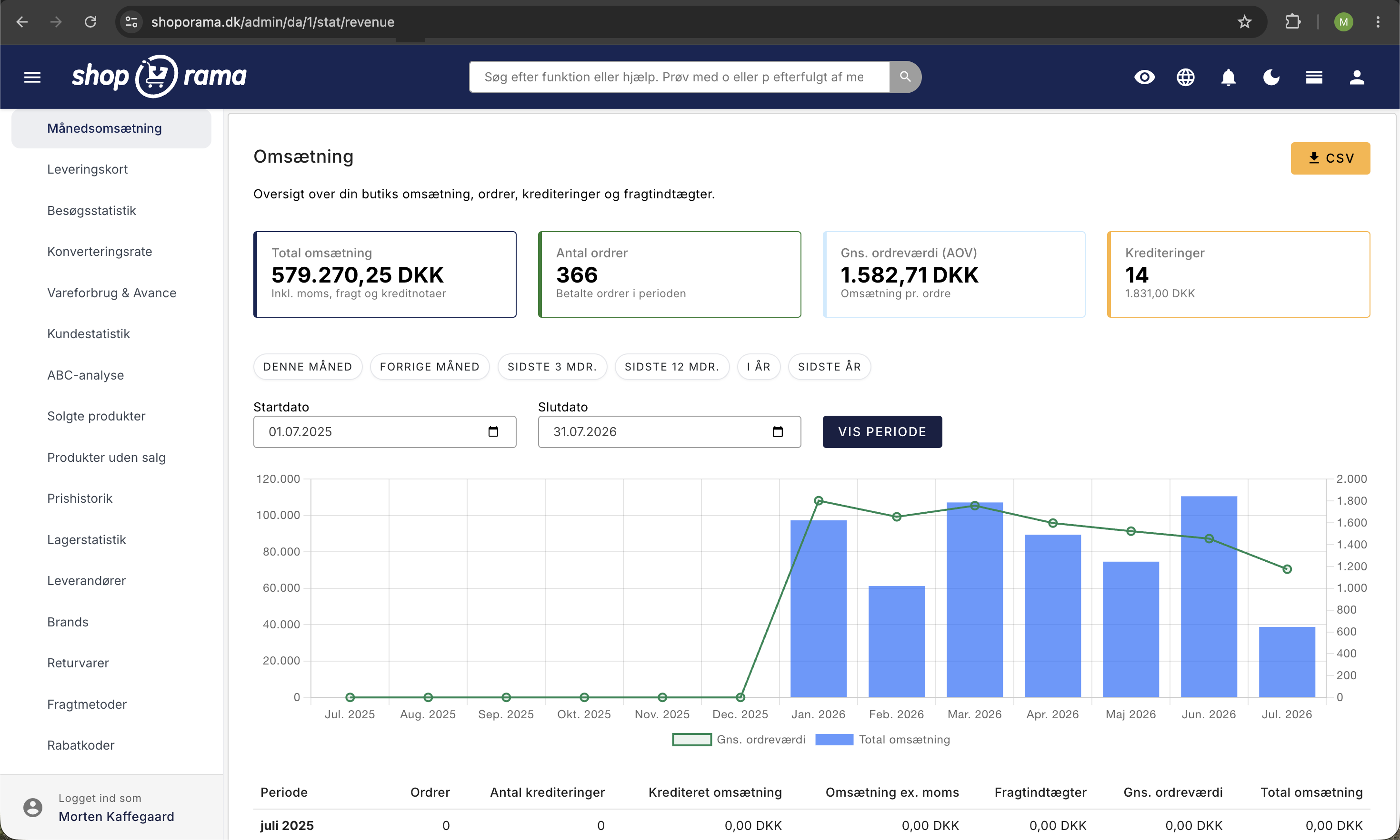
Omsætning over tid: Se tendenser og sæsonudsving
Omsætningsstatistikken under Statistik → Månedsomsætning viser dine salgstal over tid: antal ordrer, kreditnotaer (antal og beløb), omsætning ekskl. moms, fragtindtægter og samlet omsætning.
Visningen tilpasser sig automatisk den periode du vælger. Vælger du op til 31 dage, ser du daglige tal. Mellem 31 og 90 dage aggregeres til uger, og over 90 dage vises månedlige tal. Det gør det nemt at zoome ind på en travl uge eller ud for at se årets samlede mønster.
Her spotter du sæsonudsving og tendenser. Hvornår starter din travle periode? Hvornår falder salget typisk? Tallene hjælper dig med at planlægge kampagner, lagerstyring og bemanding, så du er klar, når sæsonen rammer — i stedet for at blive overrasket.
Hvad tjener du egentlig? Dækningsbidrag og avanceanalyse
Omsætning og fortjeneste er to vidt forskellige ting. Under Statistik → Vareforbrug & Avance ser du, hvad du faktisk tjener: omsætning ekskl. moms, vareforbrug (indkøbspris × antal solgt), bruttofortjeneste og dækningsgrad i procent — alt sammen opgjort pr. måned.
Et søjlediagram giver dig det visuelle overblik med omsætning og vareforbrug som søjler og dækningsgraden som en kurve. Sammenligningen med samme måned året før vises automatisk: procentvis ændring i omsætning og ændring i dækningsgrad i procentpoint, så du kan se, om din forretning bevæger sig den rigtige vej.
Mange webshopejere har oplevet, at avancestatistikken åbnede øjnene for den faktiske indtjening. Du kan sagtens sælge for mere end sidste år og alligevel tjene mindre, hvis dine indkøbspriser er steget, eller du har givet for mange rabatter. Statistikken holder dig ærlig.
Bemærk: Analysen kræver, at du har udfyldt indkøbspriser på dine produkter. Hvis der mangler indkøbspriser, viser systemet en advarsel med det præcise antal produkter og direkte links, så du hurtigt kan udbedre det. Du behøver ikke være revisor for at bruge tallene — men du skal sørge for, at data er på plads. Læs mere i den dedikerede guide til vareforbrug og avance.
Pareto i praksis: Find de 20% af produkterne der skaber 80% af omsætningen
Pareto-princippet siger, at ca. 20% af dine produkter typisk skaber 80% af din omsætning. ABC-analysen under Statistik → ABC-analyse omsætter det princip til praksis ved automatisk at sortere dine produkter i tre grupper:
- A-produkter — top 80% af den valgte metrik. Dine vigtigste varer.
- B-produkter — de næste 15%. Solide, men ikke kritiske.
- C-produkter — de sidste 5%. Mange produkter med lille bidrag.
Du kan klassificere efter tre metrikker: omsætning, antal solgt og dækningsbidrag. Det virkelig stærke er muligheden for at sammenligne på tværs. Et produkt der er A på omsætning men C på dækningsbidrag er et advarselssignal: du sælger meget af det, men tjener næsten ingenting. Omvendt er et C-produkt på omsætning der er A på dækningsbidrag skjult guld — det fortjener mere markedsføring.
Med filtre på leverandør, brand og periode (30 til 365 dage), farvekodede badges og CSV-eksport er det et værktøj der skalerer fra butikker med 50 produkter til dem med 5.000+. I stedet for at gætte, fortæller analysen dig præcist, hvad der er værd at bruge tid på. Læs mere i den dedikerede ABC-analyse guide.
Hvor godt konverterer din shop? Konverteringsrate
Under Statistik → Konverteringsrate ser du, hvor stor en andel af dine besøgende der ender med at købe noget. Siden samler de fire vigtigste nøgletal i ét overblik: konverteringsrate, omsætning, antal ordrer og antal besøgende — opdelt på dag eller måned.
Du kan skifte mellem daglig og månedlig visning og vælge den periode du vil analysere. Grafen viser udviklingen over tid, så du hurtigt kan spotte, om en kampagne, en designændring eller en sæson har haft effekt på konverteringen.
Konverteringsraten er et af de vigtigste tal i e-handel, fordi den viser, hvor effektiv din butik er til at omdanne besøg til salg — uanset trafikmængden. Selv en lille forbedring i konverteringsraten kan betyde en markant stigning i omsætningen. Læs mere i den dedikerede guide til konverteringsrate.
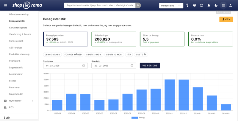
Hvor kommer dine besøgende fra? Besøgsstatistik
Under Statistik → Besøgsstatistik får du et detaljeret indblik i, hvem der besøger din webshop, hvor de kommer fra, og hvordan de opfører sig. Siden er tilgængelig via Statistik → Besøgsstatistik i menuen og kræver, at du har aktiveret intern besøgsstatistik i din webshops indstillinger.
Øverst finder du fire summary cards, der giver dig det hurtige overblik over den valgte periode: besøg i perioden (antal unikke sessioner), sidevisninger (samlet antal sider vist), sider pr. besøg (gennemsnitligt antal sider en besøgende ser) og bounce rate (andelen af besøgende der forlader siden efter kun én sidevisning). Sammen tegner disse fire tal et klart billede af, hvor aktive dine besøgende er.
Et bar chart viser antallet af besøgende over tid, så du visuelt kan følge udviklingen dag for dag eller måned for måned. Det gør det nemt at spotte, om en kampagne har trukket ekstra trafik, eller om der er perioder med usædvanligt få besøg.
En af de mest værdifulde funktioner er oversigten over trafikkilder, vist som et donut chart. Her ser du fordelingen mellem direkte trafik, Google organisk, Facebook, nyhedsbreve og andre kilder. Det giver dig et klart svar på, hvilke marketingkanaler der faktisk driver trafik til din butik — og hvilke der ikke leverer. Hvis du investerer tid og penge i Facebook-annoncering, men næsten al din trafik kommer fra Google organisk, er det et signal om at revurdere din kanalstrategi.
Besøgsstatistikken inkluderer også en analyse af gennemsnitlige besøg pr. ugedag, vist som et bar chart. Det afslører, hvilke dage dine kunder er mest aktive. Den viden er guld værd, når du skal time nyhedsbreve, kampagnelanceringer og social media-opslag — send dit nyhedsbrev den dag, hvor flest besøger din butik, og du rammer dem, når de allerede er i købshumør.
Alle data kan eksporteres til CSV, så du kan arbejde videre med tallene i Excel eller dele dem med din marketingpartner. Læs mere i den dedikerede guide til besøgsstatistik.
Rabatkoder — virker dine kampagner?
Under Statistik → Rabatkoder ser du hver rabatkode med antal gange brugt, samlet rabatbeløb, omsætning og gennemsnitlig ordreværdi (AOV). Det giver dig et klart billede af, om dine kampagner faktisk driver mersalg — eller bare giver rabat til kunder, der ville have købt alligevel.
Det vigtigste nøgletal her er forskellen i AOV med og uden rabat. Hvis kunder med rabatkode køber for mindre end kunder uden, tyder det på, at rabatten ikke motiverer til et større køb. Omvendt, hvis AOV med rabat er højere, virker kampagnen som tiltænkt — kunderne køber mere, fordi de føler de får en god deal.
Brug statistikken til løbende at evaluere dine rabatstrategier. Sammenlign koder med forskellige rabattyper (procentrabat vs. fast beløb, fri fragt vs. prisnedsættelse) og se, hvad der giver mest værdi for din forretning. Læs mere i den dedikerede guide til rabatkode-statistik.
Salg pr. kanal — hvor kommer pengene fra?
Under Statistik → Salg pr. kanal ser du ikke bare, hvilke kanaler der sender besøgende — du ser, hvilke kanaler der faktisk genererer omsætning i kroner. Det er en afgørende forskel, fordi en kanal med mange besøg ikke nødvendigvis er den, der driver mest salg.
For hver trafikkilde (Google organisk, Facebook, nyhedsbrev, direkte, betalte annoncer m.fl.) ser du antal ordrer, samlet omsætning og gennemsnitlig ordreværdi. Det gør det muligt at vurdere, hvilke marketingkanaler der giver det bedste afkast — og hvor du bør investere mere eller mindre.
Hvis eksempelvis nyhedsbreve kun står for 5% af dine besøg, men 20% af din omsætning, er det et signal om at prioritere e-mail-marketing højere. Tallene giver dig et faktuelt grundlag for at fordele dit marketingbudget, i stedet for at gætte. Læs mere i den dedikerede guide til salg pr. kanal.
Tidspunkt-analyse — hvornår handler dine kunder?
Under Statistik → Tidspunkt-analyse ser du dine ordrer fordelt på ugedag og klokkeslæt, visualiseret som et heatmap. Farverne viser, hvornår der er mest aktivitet — mørke felter betyder mange ordrer, lyse felter betyder få.
Mønstret afslører, hvornår dine kunder er mest købsklare. Måske handler de fleste om aftenen mellem kl. 19 og 22, eller måske er din butik særligt aktiv i weekenden. Den viden er guld værd, når du skal time dine aktiviteter: send nyhedsbreve lige før det travleste tidspunkt, lancér kampagner når dine kunder er online, og planlæg kundeservice efter de tidspunkter, hvor der er mest aktivitet.
Heatmappet giver dig også et overblik over, om dine kampagner rammer rigtigt. Hvis du sender nyhedsbreve tirsdag morgen, men dit heatmap viser, at dine kunder primært handler torsdag aften, kan det være værd at eksperimentere med timingen. Læs mere i den dedikerede guide til tidspunkt-analyse.
Forladte kurve — hvor mange kurve reddes?
Under Statistik → Forladte kurve ser du historik over indkøbskurve, der ikke blev til ordrer — og vigtigere endnu, hvor mange af dem der blev reddet via påmindelses-mails. Recovery rate viser, hvor stor en andel af de forladte kurve der alligevel ender som gennemførte køb.
Forladte kurve er en af de største kilder til tabt omsætning i e-handel. Ved at følge recovery rate over tid kan du måle, om dine påmindelses-mails virker, og om ændringer i timing eller indhold forbedrer resultaterne. En recovery rate på 10–15% er et godt udgangspunkt — ligger du under det, er der sandsynligvis plads til forbedring.
Statistikken viser også det samlede antal forladte kurve, den potentielle omsætning og udviklingen over tid, så du kan vurdere, om problemet vokser eller skrumper. Læs mere i den dedikerede guide til forladte kurve-statistik.
Kundefastholdelse — vender dine kunder tilbage?
Under Statistik → Kundefastholdelse ser du dine kunder grupperet efter, hvornår de foretog deres første køb (kohorter), og hvor mange der vender tilbage og køber igen i de følgende måneder. Dataene er visualiseret som et heatmap-gitter, hvor rækkerne er kohorter og kolonnerne er måneder efter første køb.
Farvekodningen gør det nemt at aflæse: jo mørkere feltet er, jo større andel af kohorten har købt igen i den pågældende måned. Et sundt mønster viser en stabil eller stigende fastholdelsesrate over tid — det betyder, at dine kunder kommer igen, fordi de er tilfredse med produkterne og oplevelsen.
Kohorte-analysen er særligt nyttig til at måle effekten af ændringer over tid. Hvis du lancerer et loyalitetsprogram eller forbedrer din kundeservice, kan du sammenligne fastholdelsesraten for kohorter før og efter ændringen og se, om det rent faktisk gør en forskel. Læs mere i den dedikerede guide til kundefastholdelse.
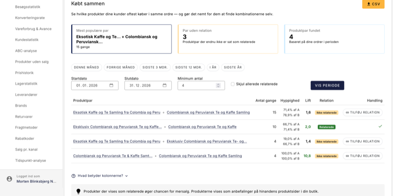
Hvilke produkter købes oftest sammen? Find skjulte salgsmønstre
Under Statistik → Købt sammen får du et overblik over hvilke produktpar dine kunder oftest lægger i kurven på samme tid. Det kan afsløre kombinationer du måske aldrig selv havde tænkt på — og som du kan bruge aktivt til at øge din gennemsnitlige ordreværdi.
For hvert produktpar vises en lift-metrik, der fortæller dig om sammenhængen er reel eller blot tilfældig. En lift over 1 betyder at de to produkter købes sammen oftere end man ville forvente — det er dem der er værd at handle på. Med ét enkelt klik kan du tilføje et par som relaterede produkter, så anbefalingerne automatisk dukker op på produktsiderne i din butik. Du kan filtrere på periode, minimumantal og skjule de par der allerede er sat som relaterede, så du hurtigt finder det næste oplagte skridt.
Vil du dykke dybere ned i funktionen, finder du en trin-for-trin gennemgang i den dedikerede guide til Købt sammen.
Hvem er dine kunder? Kundestatistik
Under Statistik → Kundestatistik får du et detaljeret indblik i dine kunders adfærd og værdi. Siden viser nøgletal som antal kunder, returkundesats, gennemsnitlig customer lifetime value og fordelingen mellem nye og tilbagevendende kunder.
Du kan se dine top 20 kunder rangeret efter omsætning og følge udviklingen i nye vs. tilbagevendende kunder over tid. En høj andel af tilbagevendende kunder er et sundhedstegn — det er langt billigere at fastholde en eksisterende kunde end at skaffe en ny.
Brug kundestatistikken til at identificere dine mest værdifulde kunder, vurdere om din markedsføring tiltrækker loyale kunder, og opdage ændringer i kundeadfærd over tid. Læs mere i den dedikerede guide til kundestatistik.
Er dit lager sundt? Lagerstatistik
Under Statistik → Lagerstatistik får du overblik over dit lagers tilstand med fokus på de produkter, der kræver handling. Siden er opdelt i tabs: dead stock, genbestilling, og lageromsætning fordelt på leverandører og brands.
Dead stock viser produkter, der har ligget på lager uden at blive solgt — bundet kapital der ikke arbejder for dig. Genbestillingslisten fremhæver produkter med lavt lager, der stadig sælger godt, så du kan bestille hjem i tide. Lageromsætningen viser, hvor hurtigt dine varer bevæger sig, opgjort i COGS og days sales of inventory (DSI) pr. leverandør og brand.
Et sundt lager handler om balance: nok varer til at dække efterspørgslen, men ikke så meget at kapitalen står stille. Lagerstatistikken giver dig de tal, du har brug for til at ramme den balance. Læs mere i den dedikerede guide til lagerstatistik.
Virker dine nyhedsbreve? Åbningsrate og klik
Hvis du bruger Shoporamas nyhedsbrevsmodul, finder du statistik for hver kampagne under Nyhedsbrev → Statistik. Her ser du afsendelsesdato, antal modtagere, åbninger med åbningsrate i procent og klik med klikrate i procent.
Tallene hjælper dig med at vurdere, hvad der virker. Hvis ét nyhedsbrev har dobbelt så høj åbningsrate som de øvrige, er det sandsynligvis emnelinjen der gør forskellen. Høj åbningsrate men lav klikrate tyder på, at indholdet ikke lever op til løftet i emnelinjen — eller at der mangler tydelige call-to-actions.
Brug tallene til at eksperimentere systematisk: test forskellige emnelinjer, afsendelsestidspunkter og indholdstyper, og lad statistikken fortælle dig, hvad dine kunder reagerer på.
Dine bedst- og dårligst-sælgende produkter
Under Produkter → Produktperformance kan du se salgsstatistik på produktniveau med mulighed for at filtrere på periode. Det giver dig et direkte indblik i, hvilke produkter der trækker salget — og hvilke der samler støv.
Performance-oversigten supplerer ABC-analysen med et mere produktfokuseret perspektiv. Hvor ABC-analysen klassificerer og rangerer, giver produktperformance dig mulighed for hurtigt at slå op på det enkelte produkt og se dets salgshistorik over tid.
Brug det til at identificere produkter der bør fremhæves i din butik, produkter der bør sættes på udsalg for at frigøre lagerplads, og produkter der måske slet ikke burde være i sortimentet længere.
Praktiske tips: Få mest ud af dine statistikker
- Udfyld indkøbspriser på alle produkter. Uden indkøbspriser kan hverken avanceanalysen eller ABC-analysens dækningsbidrag beregnes. Det er det vigtigste skridt for at få fuld værdi af statistikkerne.
- Brug CSV-eksport. Både ABC-analysen og avancestatistikken kan eksporteres til CSV. Det er praktisk, hvis du vil lave yderligere beregninger i Excel eller dele data med din revisor.
- Tjek dashboardet dagligt. Det tager under et minut og giver dig en fornemmelse af, om der er noget usædvanligt — før det bliver et problem.
- Gennemgå avancen månedligt. En faldende dækningsgrad over flere måneder er et tidligt advarselssignal. Jo før du ser det, jo lettere er det at handle.
- Kør ABC-analysen kvartalsvis. Produkternes placering skifter over tid. En regelmæssig gennemgang hjælper dig med at tilpasse lager, markedsføring og sortiment.
- Følg konverteringsraten løbende. Selv små ændringer i konverteringsraten har stor effekt på bundlinjen. Brug siden til at måle effekten af designændringer og kampagner.
- Hold øje med returkundesatsen. En stigende andel af tilbagevendende kunder er et tegn på, at din butik skaber loyalitet — og det er billigere end konstant at skaffe nye kunder.
- Ryd op i dead stock. Produkter der ikke sælger binder kapital. Brug lagerstatistikken til at identificere dem og overvej udsalg, bundling eller afvikling.
- Sammenlign metrikker i ABC-analysen. Brug funktionen "Sammenlign med" til at finde produkter der sælger godt men har dårlig margin — eller omvendt.
- Brug leverandørstatistikken til forhandlinger. Dokumenterede salgstal giver dig et stærkere udgangspunkt, når du taler med leverandører om priser og vilkår.
- Hold øje med returmønstre. Hvis et produkt eller en variant skiller sig ud, er det billigere at undersøge årsagen end at fortsætte med at håndtere returneringer.
- Sammenlign AOV med og uden rabat. Hvis kunder med rabatkode køber for mindre, giver du måske rabat til kunder der ville have købt alligevel.
- Tjek recovery rate på forladte kurve. En recovery rate under 10% tyder på at dine påmindelses-mails kan forbedres — eller at de ikke er aktiveret.
- Tjek dine trafikkilder månedligt. Hvis organisk trafik falder, kan det betyde at konkurrenter har overhalet dig i søgeresultaterne — eller at din SEO-indsats skal genopfriskes.
Kom i gang
Statistik er mest værdifuld, når det ikke er et engangstjek, men en fast del af din rutine. Brug dashboardet til den daglige puls, omsætningsgrafen til at spotte tendenser over tid, og ABC-analysen og avanceoversigten til de strategiske beslutninger.
Tilsammen giver Shoporamas statistikværktøjer dig det fundament, du har brug for til at drive din webshop mere bevidst og profitabelt. Du behøver ikke at være dataanalytiker for at komme i gang — åbn Statistik i menuen og start med det, der er mest relevant for dig lige nu.
Related articles
Conversion rate - understand and improve your stats
Understand what your conversion rate means and how to use the statistics page in Shoporama to track your progress over time.
Customer statistics - understand your customers' behavior
The Customer Statistics page in Shoporama gives you an overview of return rates, customer segments and your most valuable customers.
Warehouse statistics - overview of your warehouse
Stock statistics give you a complete overview of your stock situation - from tied up capital in dead stock to products that are running low.
ABC analysis: Find out which products make you money
Learn how to use ABC analysis to prioritize your assortment, optimize your inventory and focus on the products that actually drive your business.
Sales reports and revenue in dashboard
Guide to using the dashboard and sales reports in Shoporama to track revenue, orders and sales statistics.
See your revenue
Guide to viewing your revenue in Shoporama - both on the front page, via the detailed revenue statistics with graphs, and via order export.
Open baskets - View and restore abandoned shopping carts
Split testing in your Shoporama online store
Guide to setting up and running server-side split tests (A/B tests) in Shoporama.
Delivery Map: See where your customers receive their packages
The delivery map shows, on a map, where in the country your customers receive their packages. View hotspots with a heat map, track today’s sales...
Related features
New visitor statistics - understand your eCommerce traffic
See who visits your online store, which days are busiest and where the traffic comes from. Shoporama's new visitor statistics give you the overview.
Statistics and analytics
Dashboard, revenue, profit margin, ABC analysis and more. Shoporama's built-in statistics tools give you insights to run your online store profitably.
Your orders already know what customers want. Now you can see it
The Bought together statistics feature finds the product pairs your customers consistently buy in the same order. Add recommendations with one...
Return center - handle returns professionally
Manage returns, issue credit notes and refunds to the customer's card. With return statistics and automatic inventory management.